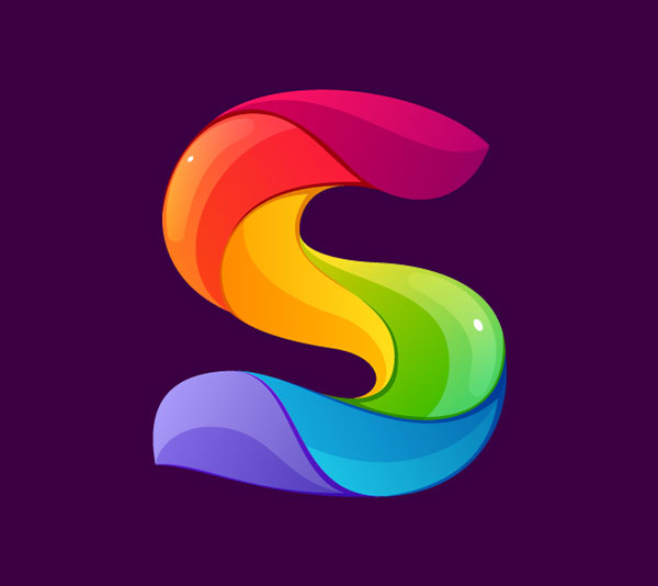
Are you feeling satisfied now that you have crafted your company's letter symbol in black and white?
Let me tell you, your job isn't complete yet.
There is more to science of a letter logo than a company initial crafted creatively. To complete the design you must use the right colors and effects that represent your business nature and brand.
This can be a tricky job as colors and effects can make or break your letter emblem.
Let's look at some effective colors and effects tips and ideas for your free letter logo design for different business natures:
• For A Corporate Company:
Here, the colors you should use must be strong and authoritative. They must be created in one solid color and your letter monogram should not consist of more than three different colors in total. The appropriate colors in this case are black, dark blue, red and gray. You can also use green if you want to represent environmental concern. The effects, in this case, should be kept at a minimum. While crafting the emblem in straight and thick fonts is the best way to depict professionalism and proficiency, you can add subtle touches by using a different color for the outline for your emblem.
• For A Technological Company:
A technological corporation wants to represent its innovation and creativity through the brand mark so here you can make your emblem colorful and fill it with effects. Use loud colors here like red, yellow or orange, purple or blue because they are bright and eye catching. To show that your company is up to date with the latest trends, you can use effects for your company initials for example, the 3 dimensional effects or the origami affect that looks realistic enough to touch and trendy at the same time.
• For A Hotel:
For a hotel, the image that you want to portray should be one of luxury, comfort and dependability. The most appropriate colors to craft your hotel symbol are brown, golden and silver. Brown naturally instigates trustworthiness while golden and silver give the impression of subtle wealth and luxury which is the exact image that a hotel wants to portray. As far as effects are concerned, you can add intricate designs to accompany your symbol so that the monogram looks chic and sophisticated.
• For the fast food industry:
For the fast food industry, red and yellow are the most popular colors as they represent energy, enthusiasm, laughter and good times. Here don't be afraid to create a two letter logo design or a three letter logo symbol for your brand but only make sure that use straight and easily readable fonts and place them at an alignment to add a unique touch.
There you have some effective tips and ideas to create a letter emblem for brand marks of different fields.
